

Quick Checklist for your eCommerce Checkout
Studies show over an over again that the large majority of online shoppers don’t make it past the first page of the checkout process. Although a high exit rate is natural at the checkout pages, too many websites are lacking on the crucial elements that could greatly improve the situation.

Learning how to keep user experience standards through the website and the appropriate way to guide your customers effectively into and out of checkout is no rocket-science. Meet our Checkout Checklist:
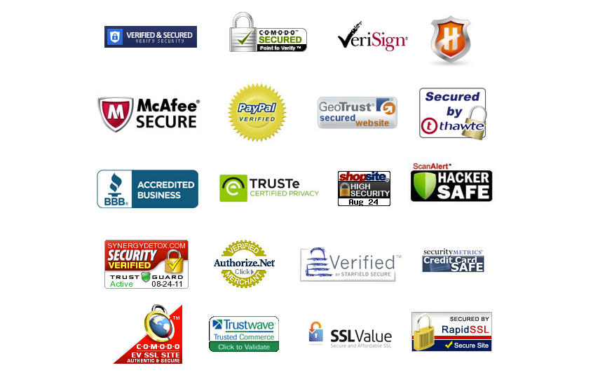
1. Security Seals
People want to hear that buying from you is 100% secured. Not only do they want to hear it from you, they want to hear it from objective and authoratitive third-party entities as well. Make sure you become a certified online shop with a secure system stamp. If you don’t want to rely on expensive certification elements then bet all you can on designing a trust-proof page. Future Now has some great advise on how to do this.
A study developed by the Baymard Institute compared most popular security seals and evaluated customer trust to each of them.
2. Take out all unnecessary items
Your checkout page should be the queen of minimalism. If there is something you don’t need to guarantee the transaction, take it out. Some websites recommend to add related suggestions to your checkout page. Make sure you only do it if your have enough catalogue variety to enable related sales which won’t affect current transactions.
Take a look at how Amazon mastered the checkout page, clean and lean:

3. Double Check for Logic
If a customer finds an error message which doesn’t allow her to proceed during checkout (especially after trying to correct it 2 or 3 times) most likely she will give up. It's very important that everything is working even with foreign credentials, such as international phone numbers, ZIP codes, among others.
In the case below it wasn't indicated that this shop didn’t ship outside the US, yet no other countries are listed and selecting a state is a mandatory field. Ups!

4. Add Progress Bar
Probably you’ve experienced this yourself: When you know how long you have to wait for something it feels much shorter than when the waiting time is unknown. Similarly, adding a progress bar lets your visitors know the time till checkout conclusion, reducing some anxiety. Besides this, progress bars with page labels let customers know exactly what you require from them .
This is an example of Game progress bar. In a glimpse, customers see how long it will take them to place the order and exactly what they will be asked for.

5. Call-to-Action
Don’t let customers wander around disoriented about the next steps. Although some customers might know their way through, inexperienced newcomers might struggle with going forward. In fact, everyone needs some direction once in a while, especially procrastinators. Adding call to actions, with clear wording, such as “Buy Now”, “Submit” or “Next Step” in highlighted buttons gives users the push they need.
Be careful with the wording you choose relating it to the action the user is about to take. Don’t anticipate the process with words such as “Order Now” when people are still halfway through the checkout.
On this example, I found myself trying to click on the grey “Submit” button for three or four times without any result. Later I discovered a checkout button below, slightly unclear. On this case the problem was that the two checkout buttons were too close, with same kind of wording and the purpose of the first was not even clear.

6. Allow for Editing
There’s nothing worse than getting to the checkout page and finding unwanted items or quantities in our basket, and not being able to fix it. Make sure everything is editable from the checkout page.
7. Avoid Mandatory Registration
Not everyone buying online wants to share its identity. In fact, anonymity is one of the major pulls of online buying. This means that if you require your visitors to enter their personal details before allowing them to checkout, you're missing out on some sales opportunities.
According to a study conducted by Econsultancy , 8 out of top 10 US retailers already provide guest checkout. In fact, 25.6% of online consumers state that they will abandon a website which has mandatory registration.
Once again, the golden rule is to make it as easy as possible for customers to buy. A trade-off between receiving full data of your market segments and more sales, which would you pick?

8. Avoid Newsletter Sign up
From a marketing point of view, newsletters are a great way to keep users thinking about your company and product. They are direct relation-building, loyalty tools.
However, according to a study from Smashing Magazine , newsletter sign up opt-ins is something customers don’t appreciate, at all, during the checkout process. This position is shared among many other eCommerce players and consultants.
9. Offer Multi payment options
Offer your customers different options to conclude their transaction. Not everyone is alike and therefore not everyone appreciates buying the same way. Especially if you are selling internationally, you need to carefully plan how you are selling for each market.
Capital One displayed a document showing payment preferences by segment. Also think about it by origin, type of product sold and overall cost to the customer. It's a wise choice to show in advance (before the customer proceeds to checkout) all your payment options, for example like Schuh does.

10. Cart Saving Option
Of course you want to secure that sale today. However, not everyone will be as ready as you are. Allowing visitors to save their cart for later purchase is a good strategy. Meanwhile, think about sending them automated e-mails, reminding them that their loved products are still waiting for them.
You can find a great article about abandoned cart email examples on the Moosend Blog - take a look.
11. Live chat Support
One thing you should totally avoid on your customers, is the sense of disorientation. Even though design, symbols and elements can help you a lot in guiding them, there will always be cornercases in which people don't follow the directions or understand the process. Also, there are always unanswered questions on the customer's mind, from logistic information, to security standards, you name it.
For these situations, live chat is an optimal solution to include in your checkout pages. This small widget will allow your visitors to ask you questions during the checkout process, giving them the opportunity to get answers before abandoning the process.
Also, it’s very common that during a chat the operator manages to upsell or suggest related items, creating value from the chat itself.
About Userlike
Userlike is live chat software for websites and messaging apps, allowing companies to chat with their (potential) customers directly over the website and apps like WhatsApp and more. Look here for more information.
