
Top 6 Characteristics of Landing Pages that Convert
Conversions. That’s the word on every marketer’s lips. And it should be, for without the creation of conversions, those marketers would be out of work. A brilliant landing page can be a dream come true for marketers – indeed, it can even make dreaming possible once more, for a poor landing page can be a sad and lonely place, something that a lot of sleep can be lost over.

The purpose of a landing page is to move a casual visitor to a website down the conversion funnel and turn them into at a lead, or even a sale. But this isn’t an easy task by any stretch of the imagination. The psychology lurking behind such pages when it comes to crafting them can oftentimes be a little daunting and indeed lead to the odd creative block – if I use the colour red, is it eye-catching or alarming? Do pop-ups irritate the visitor? My goodness, what does the customer really want?
The Perfect Landing Page?
Unfortunately, there is no set standard or template for the perfect landing page that will convert on every site every time. But of course there isn’t – your brand is unique, your products are unique, you are unique, and indeed your visitors will all be unique. Therefore your landing page must be unique, also. It may also be the case that you have to create several unique landing pages when trying to convert your several different audience types.
Those visitors that arrive at your landing page via Google are quite likely to be different types of potential customer than the ones who arrive there via Twitter or Facebook or LinkedIn. That is why there’s no generic type of landing page that will work well for all visitors – you will of course have to create landing pages that are tailored towards each of your separate campaigns, and indeed each of your social media outlets, email campaigns, Google ads or otherwise.

Every landing page has a different goal, is arrived at from a different site, is read by a different user, is advertising a different product or service, and is embedded within a different niche. As such, there is not a one size fits all solution to the creation of a perfect landing page – however, there are some unifying elements that can be found to be similar and that go a long way towards actually characterizing the very best ones. So, let’s take a look at some of those elements so that you’ll be equipped with plenty of knowledge by the time you get to work on creating the most compelling, conversion-busting landing page that has ever been produced for your company.
1. The Headline
Firstly, you need to begin where your viewers will – at the beginning. Intuitively enough, this is of course with your headline. With it you must pique interest, attention and, importantly, immediate understanding of what your product or service is all about. With this latter point in mind, it's best if you can manage to incorporate an image that communicates the usage and benefit of what you’re offering.
But, first and foremost, it’s in the wording of your headline that you must focus your attention. It must be short, concise, and to the point – up to about 6 words is usually about right, certainly never more than 10.
Take a look at these examples. Firstly MailChimp – notice the key point of what a user is signing up for is captured in just 3 words, and those 3 words are indeed what the eye is immediately drawn to.

The use of colour here is very well designed – the white lettering standing out cleanly and clearly against the soft blue gives the impression of friendliness and ease of use. Indeed, the whole thing is very well designed – it’s enticing, attention grabbing, simple, informative, and the image of the happy MailChimp lends a comforting cuteness to the whole thing that just simply works. Here’s another example:

ShortStack’s headline again is very clear and precise. The viewer consumes the message at a glance. Although the actual headline is simple and is certainly not trying to be clever, the accompanying image subtly indicates the range of devices on which the said apps will be available, which is very clever indeed.
You will notice on both of these examples the smaller text just below the headline, which is the second most important part of a creating a landing page that converts – the sub-headline.
2. The Sub-headline
Now that you’ve grabbed the user’s attention with a great headline (and ideally an accompanying image), it’s now time to put an equally great sub-headline to build on that user’s interest and ultimately make them really think about how great the product or service is that you’re offering.
Indeed, the main element of the sub-headline that should be your focus is in its persuasiveness. The idea of the sub-head is in fact quite similar to that of the headline – it too should be interesting and ultimately convey a greater understanding of your product or service – but here you’ve got a little extra space and a few more words to play with to take the concept a little bit further. Indeed, your subhead should offer a little more detail and depth about you and your brand.
If we look back at the MailChimp example above, we can see that in just 28 words, the core functions of the service are summarised clearly and concisely in the sub-headline. The designer has nailed it in a nutshell – it takes no more than about 5 seconds to read, and all the salient information is there. What’s particularly nice is the final little sentence: “It’s like your own personal publishing platform.”
3. Images
Great landing pages have great images. It’s that simple. As mentioned above, the image you choose should help boost the overall message of your campaign. It should help to illustrate exactly what it is you’re offering and shouldn't be too abstract or arbitrary (no matter how good they look).
If you’re selling a physical product on your landing page, then of course it makes sense for a picture of the product to be included. If, however, it’s a service that you are trying to sell, then the image you create or choose should be highly relevant.
Importantly, you should prevent using a standard stock image, because of the likelihood that some of your more prolific internet users will have come across it somewhere before, which will give the impression that your brand might be cheap, and of course it will do nothing for your uniqueness.
Also, your image or images must be of high quality, this includes if you are using screenshots that demonstrate the functionality of your software (if that’s what you’re selling).

Here, Basecamp uses a friendly illustration that not only adds colour and a smile to the landing page, but also very gently directs the user towards the all-important conversion-making form.

Here, Netflix makes use of an image of a family enjoying the service the company offers. Outside the window we can see a bike, skateboard and the football, all action-packed stuff, but now it’s family time all together in front of some great TV. It’s quite a compelling message that adds another layer of value to the service advertised.
4. The Value Proposition
The headline, sub-headline and the image of your landing page also need to combine to communicate one very important thing to a potential customer – the true value of signing up to the service, or indeed purchasing the product.
The value proposition needs to almost have pride of place on the landing page – it’s the thing that answers that all-important question that all your users will be asking themselves: “What’s in it for me?”
Sometimes you’ll find value propositions listed in bullet point form, other times it is imbedded in the sub-headline (as in with MailChimp above), and still others you will find it in the image – as highlighted above, Netflix do a fantastic job of this with their image of the family, and so do ShortStack with their image of the multiple devices that the apps will be available on. Let’s take a look at a couple more:

Here, register.com makes use of the bullet pointed list to show the extra value that their service offers. As you continue to scan down the page the user is presented with more and more information about what they will get if they sign up.

Geico uses its headline to push the value proposition in no uncertain terms, and then use an image of some cash to bolster that message. What’s more, they even manage to work the word ‘Free’ into their call to action, which brings me onto the final and most vitally important elements of a successful landing page…
5. The Call to Action (CTA)
The CTA is the most important element of all. It’s the button, which, if clicked, creates the conversion. So, what are the essential features of the CTA?
Firstly, it must be a button. Internet users have been trained to expect the CTA to be a button, so to try and be clever and use anything else will simply cause confusion. Users know what a button does, so stick to that.
Secondly, it must be big. Perhaps to say the bigger the better might overstate things a little – you don’t want one that takes over the whole screen leaving no room for your headline, sub-headline and image. But, making it big enough so that users can easily hover their cursor (or indeed their finger) over it without any difficulty is essential, and of course, making it nice and big means that it will be noticeable.
Noticeable is key – your CTA button needs to jump out from the page, so choose a contrasting colour that enables this, though of course it must match the colour scheme of your landing page as a whole, and should not be garish at all.
The other most essential thing that your CTA should include is some compelling copy. Now, as the button – even a big button – will be relatively small, there naturally won’t be a lot of room for more than about 3 or 5 words. The trick of great CTA copy actually lies in the psychology of the message. Rather than directing user to do something – “Sign Up”, “Submit” – you want to try and tell them that by clicking the button they will immediately receive something of value to them: “Download My Free eBook”, “Get My Free Quote”. Let’s take a look at a couple of examples:

Here, eDiets’ CTA button is nice and large, it stands out blue against the grey (and is in keeping within the colour scheme of the page and the brand) and the copy is easy to read, and clearly offers the user something, rather than simply telling them what to do.

Here, Square nicely manages to work that very convincing word “Free” into their CTA button, and again have chosen a contrasting blue colour to make their suitably large button stand out. All in all, a pretty successful CTA button.
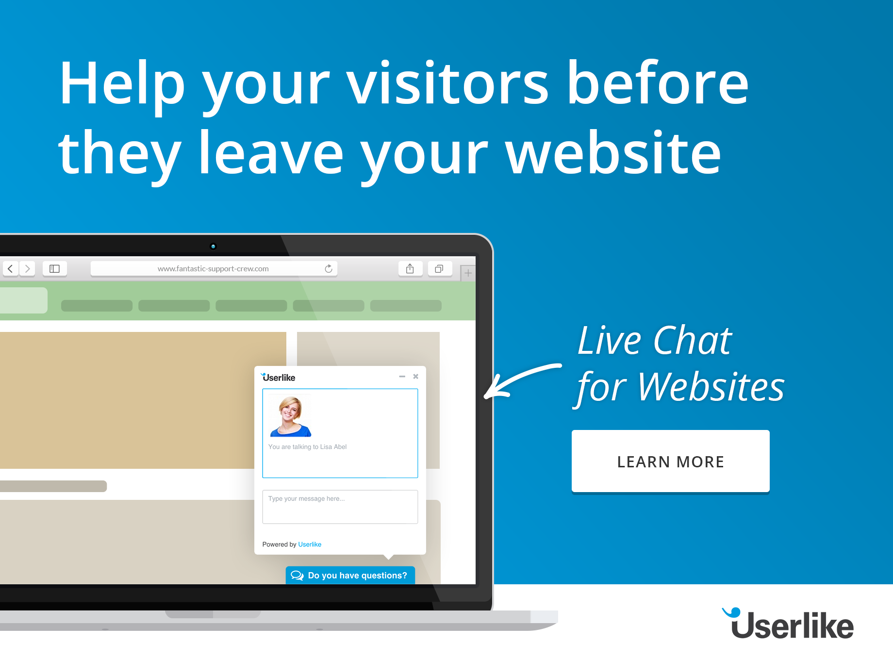
6. Live Chat Support
One of the strongest conversion tools that you can get for your online shop is Live Chat software that allows you to chat with your online visitors . Even if you make your landing page close to perfect, there will always be visitors with unanswered questions. Of course you cannot answer all potential questions on your page, that would destroy its clearness. That's where live chat comes in. With a click on the button visitors can get real time support, allowing you to provide the answer and make the conversion while they are still on the page.
To Conclude
Your landing page is where your conversions happen, so it is essential that you take the time to build them with great care and incorporate all of the above points. To fine tune your efforts, it is also highly recommended that you conduct some A/B testing to ensure that your landing page is fully optimised for high conversions, and of course you may want to consider building different ones for users who arrive from different sites. There is no one size fits all solution to the perfect landing page, though all the great ones contain a blend of the essential elements as outlined above, and so yours must too. Have fun with it, be creative, and always, always, always make them unique.
